


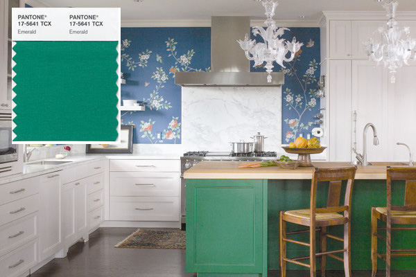
 Pantone says emerald green evokes a sense of balance and harmony. Image: Andrea Monath Schumacher, A.S.I.D. Allied, O Interior Design/Emily Minton Redfield, photo
Goodbye Tangerine Tango. Hello emerald, Pantone’s 2013 color of the year.
Why emerald, or as Pantone’s swatch names it: 17-5641?
“Green is the most abundant hue in nature — the human eye sees more green than any other color in the spectrum,” says Leatrice Eiseman, executive director of the Pantone Color Institute, a color consultant to corporations.
Eiseman says emerald sparkles, fascinates, and “brings a sense of clarity, renewal, and rejuvenation, which is so important in today’s complex world.”
Tangerine Tango, last year’s color queen (and my new favorite hue), was a pinkish orange that packed an energy punch. 2013’s emerald is a vivid, verdant green that “enhances our sense of well-being … promoting balance and harmony,” Pantone says.
Expect to see the color on everything from kitchen colors to gas grills to $25 commemorative mugs.
Emerald green: love it or hate it?
Read more: http://www.houselogic.com/blog/painting/pantone-color-of-2013-emerald/#ixzz2I062r4Cf